Cumulative Layout Shift (CLS) is one of the most important user experience and web performance metrics. CLS is part of Web Vitals (LCP, FID, and CLS), essential metrics for a healthy website defined by Google. It measures the layout stability of a web page. In this guide, you will understand what CLS is, how to measure it, and, how to improve its score. Keep reading!
What is CLS?
CLS or Cumulative Layout Shift is a new web performance and user experience metric. It aims to reflect the layout stability of a web page. It tells how often a user is experiencing unexpected layout moves when loading a web page.
We have all encountered websites, especially on mobile, that still moving up, down, right, and left when loading. Text is appearing, you start to read a news article, and…an image shows up, hiding the text down. You think it is ok now, you want to click on “read more”, and the page move again and you miss click an ad.
CLS is an important metric, a low or 0 value is a sign of a delightful loading experience. A high CLS value means a poor and frustrating one.
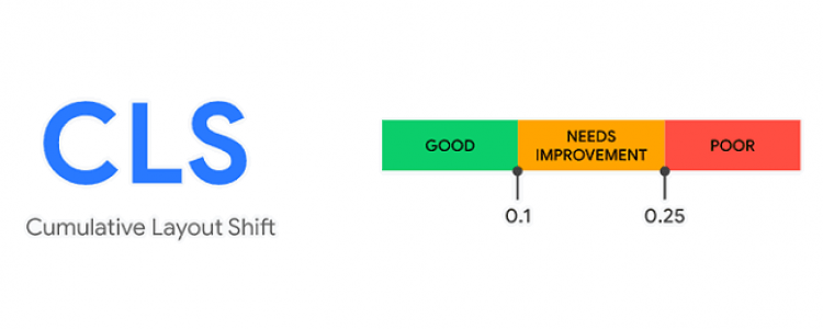
Good, average, and poor CLS?
A good CLS should be less than 0.1. On a domain level, try to reach the 75th percentile of page load across mobile and desktop users.
Comparing to LCP, CLS has a lower weight in Lighthouse score calculation.
How to measure CLS?
Cumulative Layout Shift can be measured in both synthetic (lab) and field (Real User Monitoring).
CLS in field (Real User Monitoring):
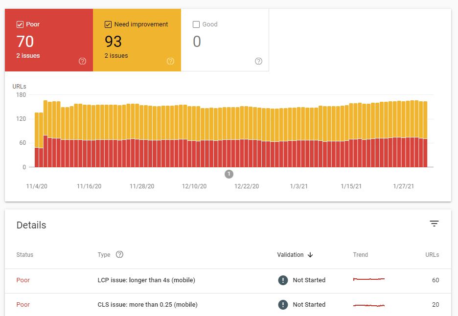
SELECT p75_cls, small_cls AS good, medium_cls AS needs_improvement, large_cls AS poor FROM `chrome-ux-report.materialized.metrics_summary` WHERE origin = 'https://netflix.com' You can also check Web Vitals report on Search Console It also possible to measure CLS with PageSpeed Insights (both field and lab) CLS in synthetic tools: Chrome Web Vitals extensionGoogle LighthouseWebPageTestGoogle Chrome Dev Tools Network tabMeasure CLS with JavaScript Lighthouse report showing a good CLS score Chrome DevTools Network panel showing Layout Shifts TIP: Click on View JSON result to have detailed Layout Shifts data
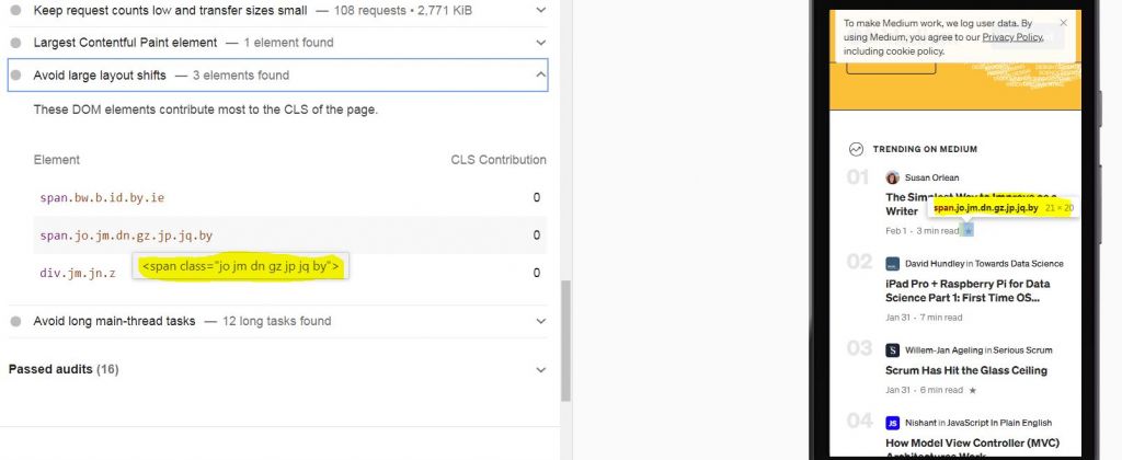
Which elements are shifting?
To know which elements are shifting, run a Lighthouse audit and scroll down the report until the “Avoid large layout shifts” section. Click on it to see the list of shifting elements.
Useful resources about CLS:
What’s next ?
Optimize your web pages to reduce layout shifts. Web pages stability provides a delightful and stress-free user experience.
Think about optimizing your LCP with this guide and I’m looking forward to your comments and questions.
Why Does CLS Happen?
Layout shifts occur when visible elements change their position from one rendered frame to the next. The most common culprits are images, ads, embeds, and iframes without reserved space, dynamically injected content, and web fonts that cause text to reflow. When the browser encounters an element with unknown dimensions, it renders the page without reserving space for it. Later, when the resource loads, the element pushes surrounding content, causing a jarring shift.
Another frequent cause is late-loading CSS or JavaScript that alters the layout after the initial paint. For example, if a script inserts a banner or a cookie consent notice at the top of the page, everything below it moves down. Similarly, animations that change properties like top, left, or margin can trigger layout shifts if not handled carefully.
Understanding the root causes is the first step toward prevention. By identifying which elements are most likely to shift, you can proactively reserve space or avoid inserting content that disrupts the user's reading flow.
How CLS Is Calculated
CLS is calculated by multiplying two factors for each unexpected layout shift: the impact fraction and the distance fraction. The impact fraction measures how much of the viewport is affected by the shift, while the distance fraction measures how far the unstable elements moved relative to the viewport.
The formula for a single layout shift is: impact fraction × distance fraction. The CLS score is the sum of all individual layout shift scores that occur during the page's lifespan, excluding shifts that happen within 500 ms of user input (since those are considered expected).
For example, if an image loads and pushes a block of text down by 25% of the viewport height, and the impacted area covers 50% of the viewport, the layout shift score would be 0.5 × 0.25 = 0.125. This single shift alone would exceed the "good" threshold of 0.1, highlighting how even one significant shift can harm your score.
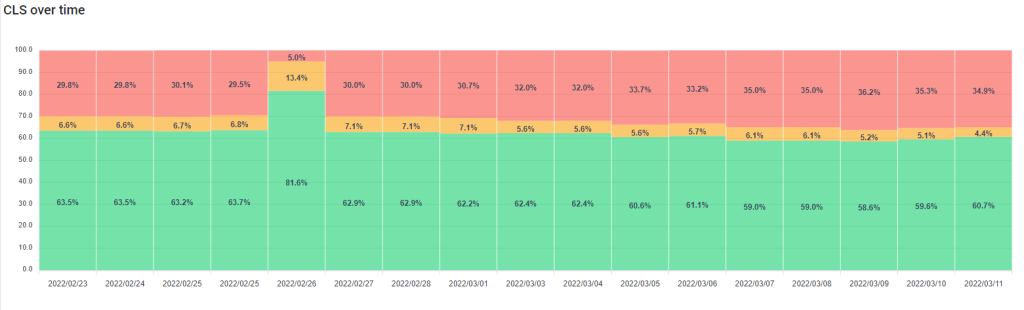
It's important to note that CLS is cumulative, so multiple small shifts can add up to a poor score. Monitoring CLS over time, especially in the field, helps you understand the real-world experience of your users.
Common Causes of Layout Shifts and How to Fix Them
Addressing CLS requires identifying and mitigating the specific elements causing instability. Below are the most frequent offenders and actionable solutions:
- Images without dimensions: Always include width and height attributes on images and video elements, or reserve space using CSS aspect-ratio boxes. This allows the browser to allocate the correct amount of space while the media loads.
- Ads, embeds, and iframes without reserved space: Reserve space for ad slots using CSS min-height or a placeholder element. For responsive ads, use the ad network's provided sizing guidance to estimate the largest possible ad size.
- Dynamically injected content: Avoid inserting new content above existing content unless it's in response to user interaction. If you must insert content, reserve space beforehand or use a container with a fixed height.
- Web fonts causing FOIT/FOUT: Use font-display: optional or font-display: swap in combination with preloading critical fonts and matching fallback font metrics to minimize text reflow.
- Animations that trigger layout: Animate only transform and opacity properties, which are compositor-friendly and do not cause layout shifts. Avoid animating width, height, top, left, or margin.
By systematically addressing these causes, you can dramatically reduce CLS and improve the overall user experience.
Advanced Techniques for CLS Optimization
Beyond the basics, there are several advanced strategies to ensure layout stability. One effective approach is to use CSS containment with the contain property. This tells the browser that an element's layout is independent, preventing shifts from propagating to other parts of the page. For example, applying contain: layout to a widget or component can isolate its internal changes.
Another technique is to implement a skeleton screen or placeholder UI that mimics the final layout. By showing grey boxes or blurred placeholders in the exact dimensions of the eventual content, you eliminate shifts when the real content loads. This is especially useful for image-heavy pages or data-driven applications.
For single-page applications, consider using the History API to manage dynamic content updates without full page reloads. When navigating, ensure that the scroll position is maintained and that new content is rendered in a way that doesn't push existing content unexpectedly. Libraries like React and Vue offer built-in features to help with this, such as React Suspense and Vue's transition modes.
Finally, regularly audit your site with tools like Lighthouse and the Web Vitals extension to catch regressions. Incorporate CLS monitoring into your CI/CD pipeline to prevent new features from introducing layout instability.
Measuring CLS in Real User Monitoring (RUM)
While synthetic tools provide a snapshot, Real User Monitoring (RUM) gives you the true picture of how actual users experience layout shifts. RUM captures CLS data from real devices and network conditions, helping you identify issues that lab tests might miss. You can implement RUM using the web-vitals JavaScript library, which is lightweight and easy to integrate.
Here's a basic example of how to track CLS with the web-vitals library:
import {getCLS} from 'web-vitals'; getCLS(console.log);
This will log the CLS value for each page load. You can then send this data to your analytics platform of choice, such as Google Analytics, to analyze trends and set performance budgets. Pay attention to the 75th percentile (p75) of CLS, as recommended by Google, to understand the experience for the majority of your users.
By combining RUM data with lab tests, you can create a comprehensive performance strategy that keeps layout shifts at bay and ensures a smooth, stable browsing experience for everyone.